
Purpose
The purpose of this document is to document the Power BI reports that are delivered as part of the LISA product. All the reports that will be discussed in this document can be found in the ‘Subscription overview’ workspace, by navigating to the specific tab depending on the report group which is required.
Analytics reports group
The ‘Analytics’ report group contain several reports that provide LISA specific analytics regarding subscription sales, subscription cost, subscription plan counts and where the subscription clients reside. Throughout the following sections, each report included in this report group will be analysed so that the user is capable of understanding what the use of each report is. All monetary figures that are used in the following charts are reported in accounting currency.
Sales Margin (Bar & Line Chart)
Both these reports visualise the same data but in a different format. Data shown in this report is acquired from posted subscription actions that reside in F&O. The main aim of these reports is to highlight the sales margin for each month where there was posted subscription revenue and cost.
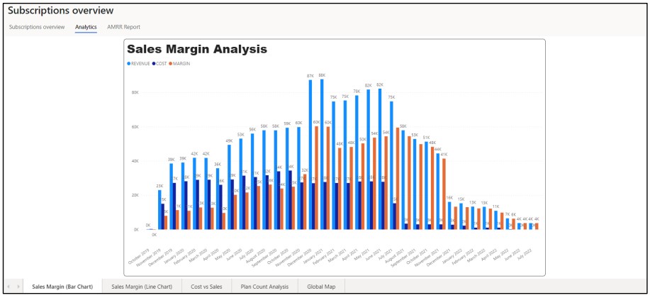
Figure 1: Sales Margin Line Chart
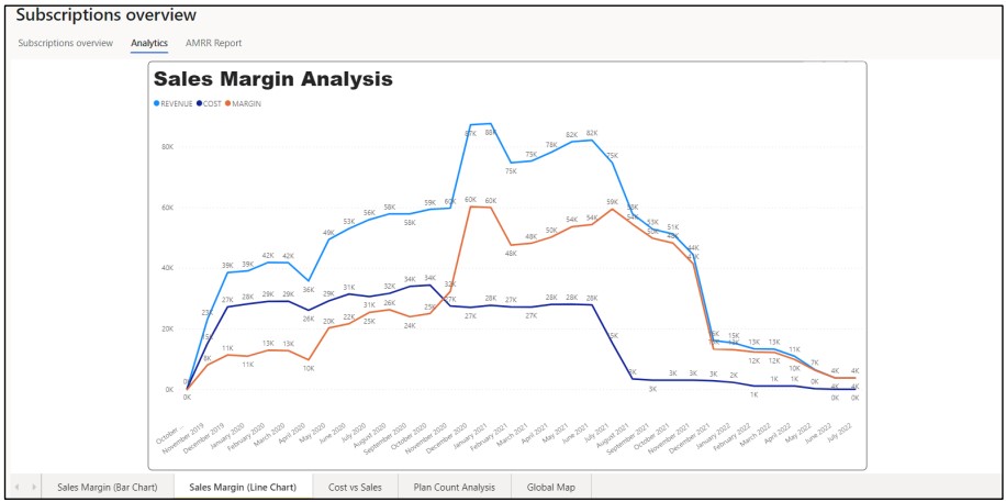
Figure 2: Sales Margin Bar Chart
Cost vs Sales
This report visualises the cost vs sales for each month where there was posted subscription revenue and cost.
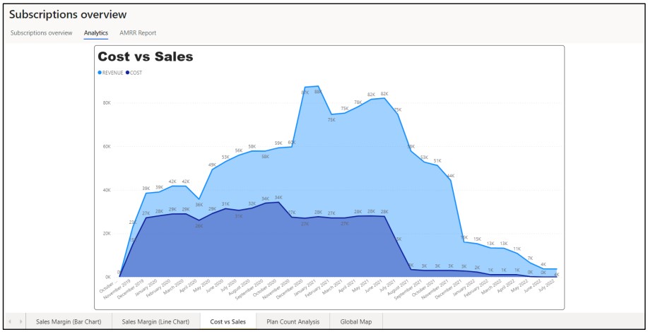
Figure 3: Cost vs Sales Chart
Plan Count Analysis
Highlights the number of plans that were published per month of subscription usage. Each colour in this report relates to a specific program type that is configured in LISA.
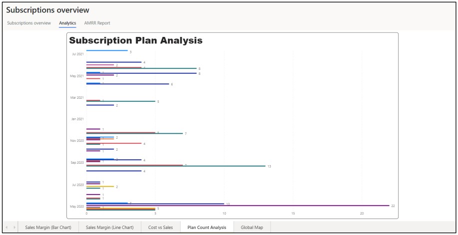
Figure 4: Plan Count Analysis Chart
Global map
Visualises sales and cost data depending on the geographical location of the customers for which subscription are being used.
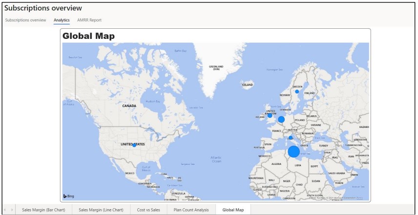
Figure 5: Global map chart
AMRR reports group
The AMRR report group contains multiple reports that are used to visualise important information regarding subscription usage and action generation. All reports in this group use posted actions to acquire the data, as well as related information from the subscription plan lines and subscription plans. All reports included in this group are filterable by Company. All monetary figures that are used in the following charts are reported in accounting currency.
AMRR
AMRR is usually split in two, ARR (Annualised Recurring Revenue) and MRR (Monthly Recurring revenue). In this report, three charts are provided, two for the previously mentioned reports and another report which is caller QRR or Quarterly Recurring Revenue. All data in these reports is also grouped by the reason code that is provided on the subscription plan line. The use of these reports is to show changes in subscription revenue per period specified and per reason.
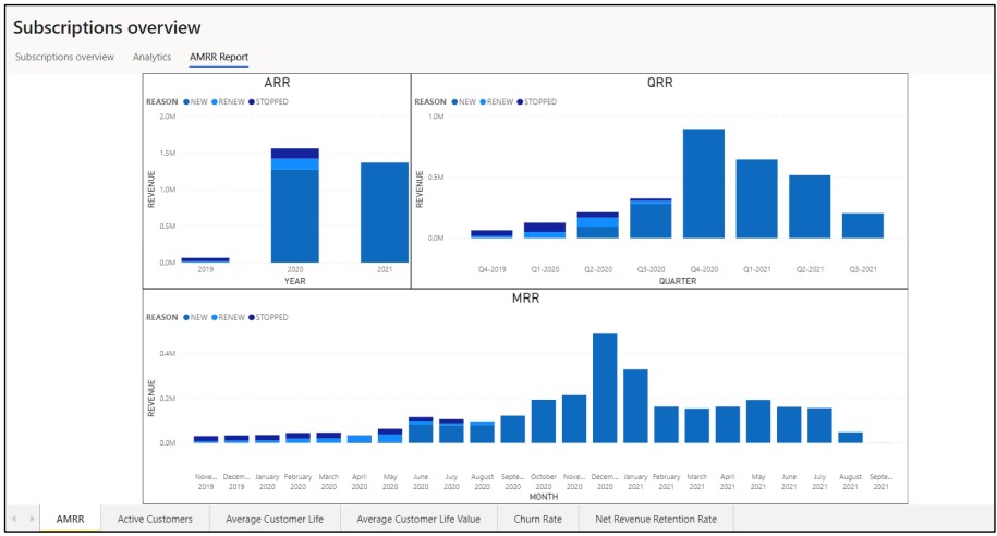
Figure 6: AMRR chart
Active Customers
This report is used to visualise the change in the number of active customers that are using subscriptions at a given time. This report also includes three charts, giving the user the flexibility of visualising data grouped by three different periods: monthly, quarterly, and yearly. This report uses the subscription plan and subscription actions table to determine how many customers had posted action in the specified period.
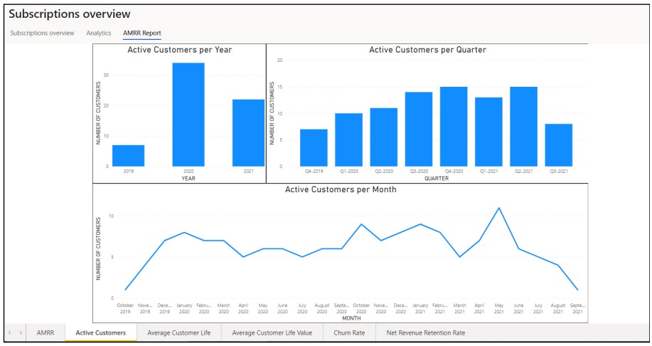
Figure 7: Active customers chart
Average Customer Life (in months)
The average customer life report is used to see what the average customer life is for customers that are using subscriptions. The average customer life is calculated by using taking the difference between the dates of the first subscription plan line that was created, and the end date of the last subscription plan line (in months) created divided by the number of customers that are currently using subscriptions.
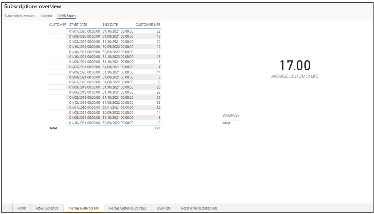
Figure 8: Average customer life chart
Average Customer Life Value (in months)
The average customer life value report is an improvement over the average customer life report, where it also visualises the average monetary value that a customer is expected to spend over the duration of their life.
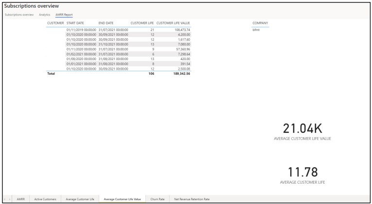
Figure 9: Average customer life value chart
Churn Rate
This report is used to the user can get some insight into how much cancellations were performed over a specified period. This report is grouped by month, quarter and year and shows several details regarding cancellation in subscription. The churn rate percentage is calculated by taking the percentage of churned lines divided by the total amount of lines present in the system in the specific period. This report also gives and indication into the monetary value that those lines represent whilst also giving actual figures regarding the number of churned lines and the number of total lines.
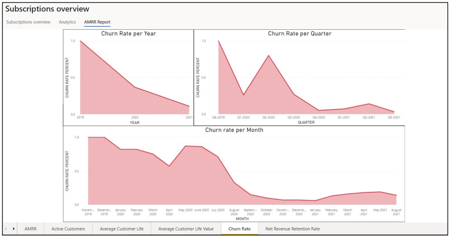
Figure 10: Churn rate chart
Net Revenue Retention Rate
This main goal of this report is to give an indication as to what percentage of revenue the user was able to retain from the previous period. The calculation that is based to calculate the NRRR (Net revenue retention rate) percentage is the percentage of the amount that was sold in the previous period divided by the amount sold in the current period. This report is also grouped by month, quarter, and year.
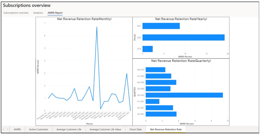
Figure 11: Net Revenue Retention Rate Chart